
Overview
Alterations by R.C.’s website was getting views, but not enough customers.
When Alterations by R.C. opened, there was a lot of online buzz around the newly opened store. Site traffic was up, and the inbox was full. However, none of those inquiries and clicks were translating to real in-store customers.
Solution
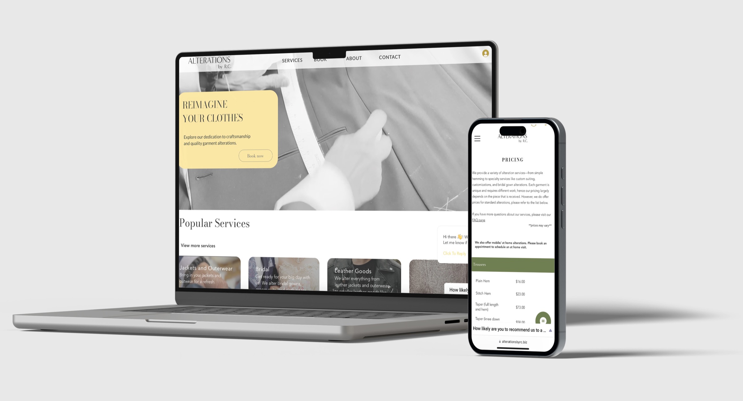
Drive potential customers to the store by presenting relevant information about business services above the fold, optimizing the booking appointment flow, and tailoring the website to align with business values.
Outcomes
After the changes to the website, in-store attendance rose 15%, bounce rate dropped by half, and questions regarding pricing in the store’s inbox dropped completely.
Discovery
Poor layout and lack of visual identity were keeping customers away from the store.
Navigation on the current site was confusing. Pages and relevant information were hidden inside a hamburger menu. This made it difficult for customers to access information about services and pricing, and subconsciously made it difficult for customers to trust the business.
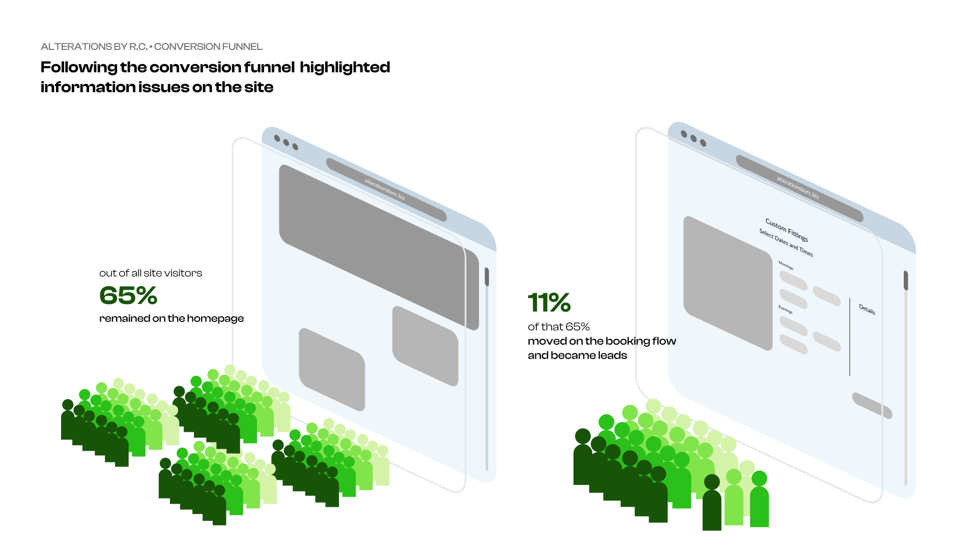
There were many pain points on the homepage, but the primary issue was the site’s navigation.
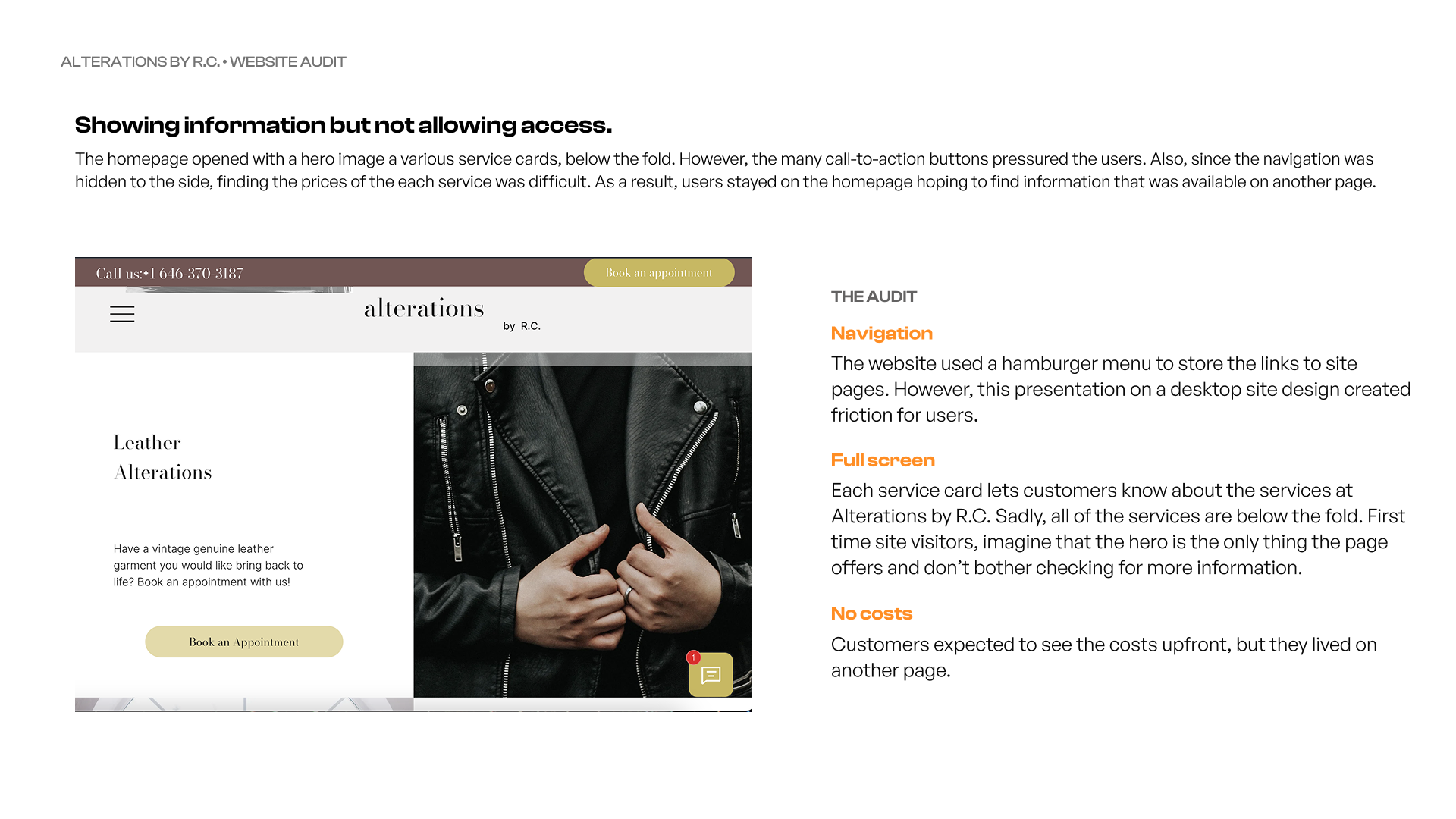
Although hamburger menus are popular in mobile site designs, this original site was built for desktop. Therefore, it had two issues. One, it did not have a fluid responsive design, which led to the second— a hidden and confusing menu. As a result, customers had issues navigating to other pages, primarily the pricing page. This issue was clear in the number of inbox messages asking about pricing information.
Research
Reorganizing site architecture to make relevant information more visible.
Looking at the initial data, I assumed that the site only had a discoverability issue, but a deeper look into the messages and bounce rates implied a findability issue as well.
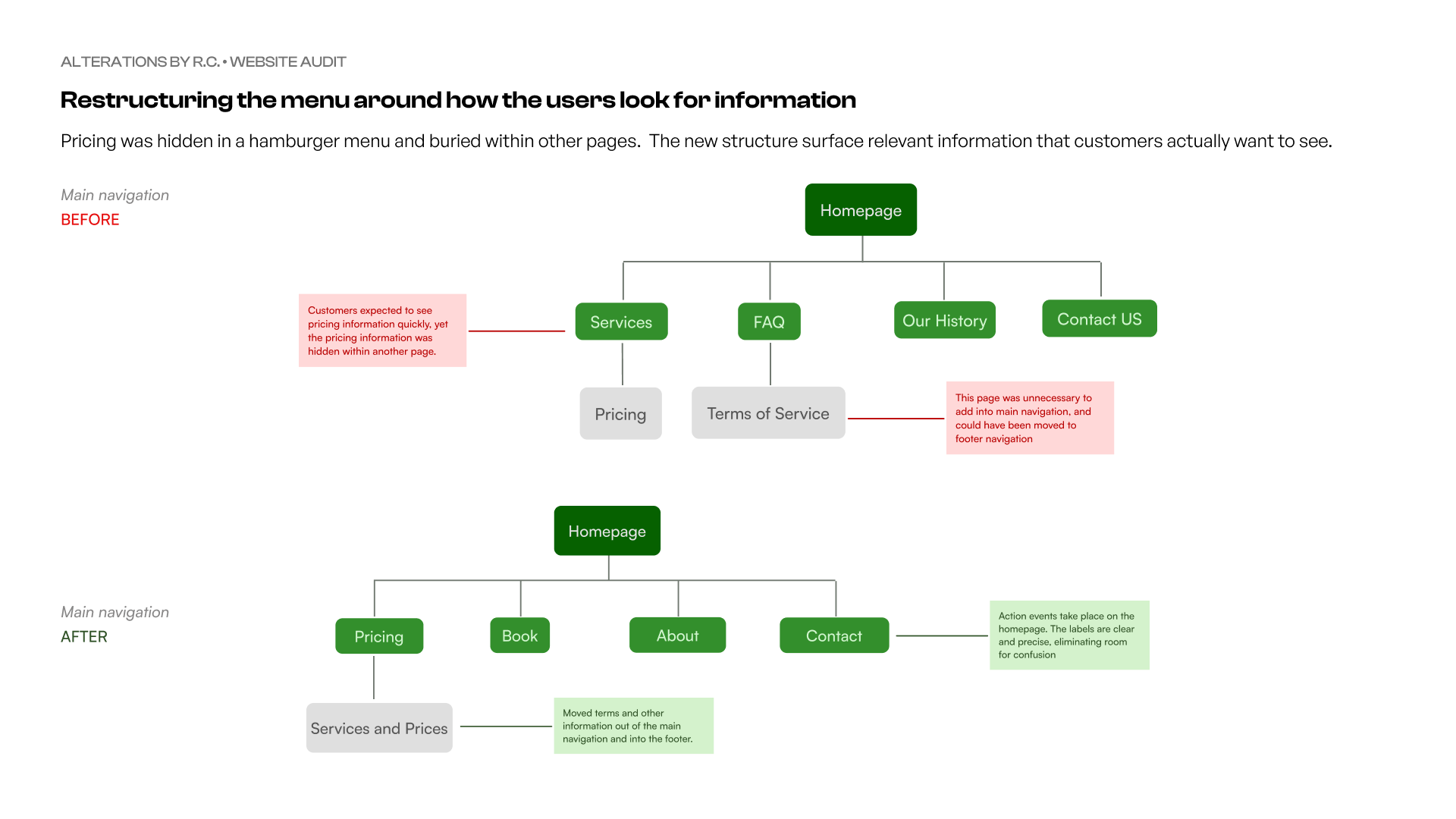
Swapping the hamburger menu for a horizontal bar menu allowed users to navigate freely from one page to the next, giving them access to information and removing doubt from their journey.
Process
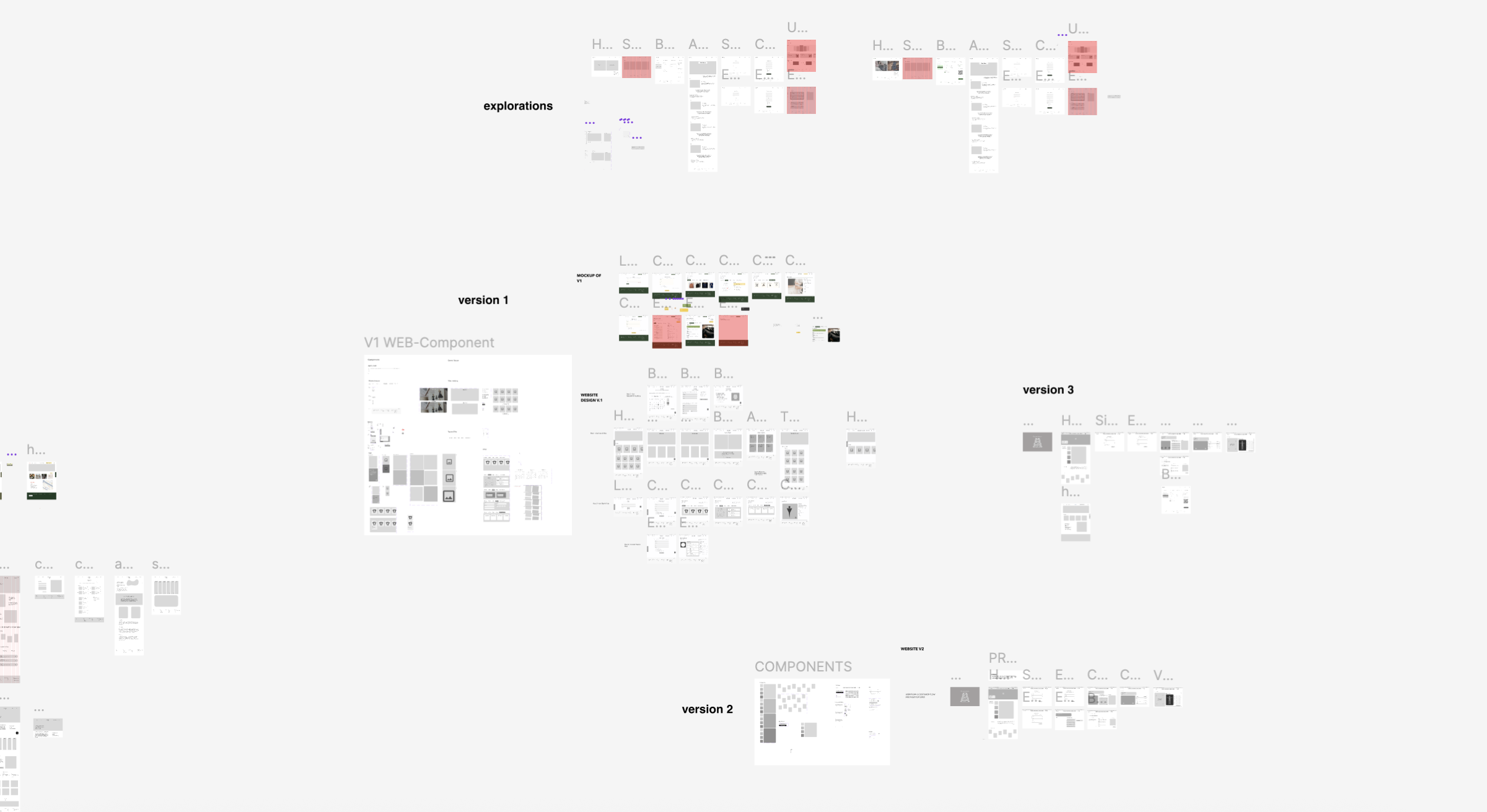
Designing the homepage within constraints.Explorations
In the redesign, I wanted to go beyond improving navigation. I wanted the users to be part of the process.
Exploration 1
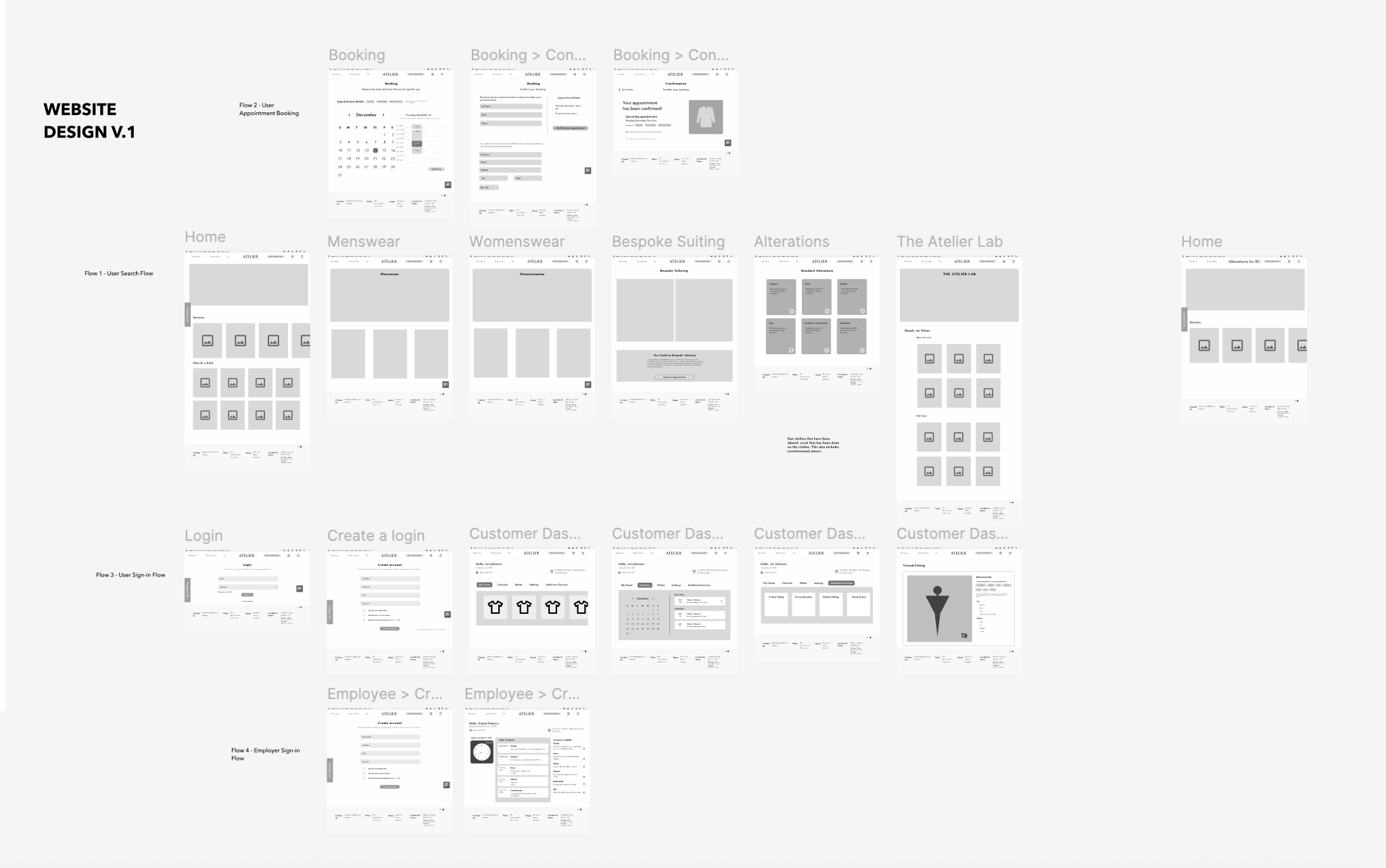 The first iteration of the design divided the services into menswear and womenswear, but this design added more pages— increasing the risk of page bloat. However, this iteration, with customer profiles, helped ideate a customer-facing self-service kiosk. Both of these ideas came from a necessity to speed up the alteration workflow for staff while finding ways to include customers in the alterations process.
Exploration 2
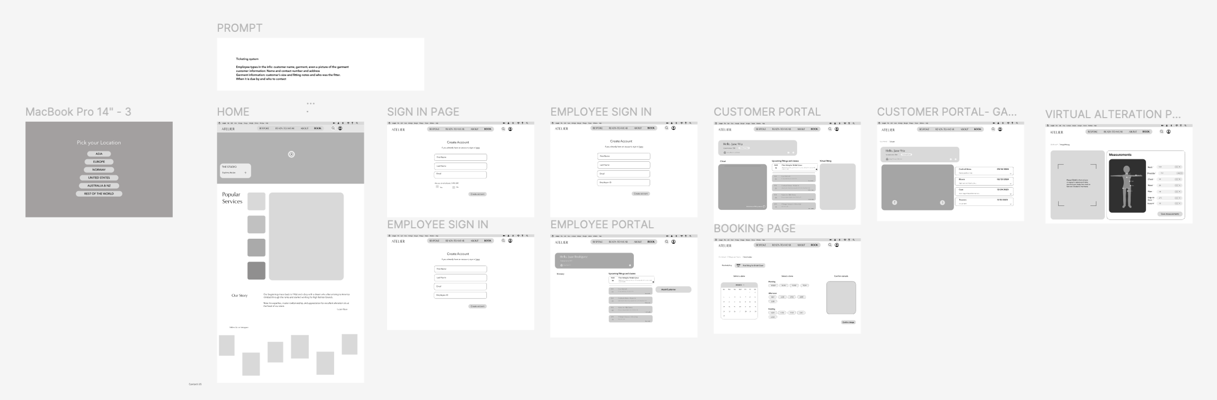
The second iteration heavily relied on video and image content, an attempt to create a more engaging site. However, this layout did not make pricing easily accessible for customers.
Testing and iterating
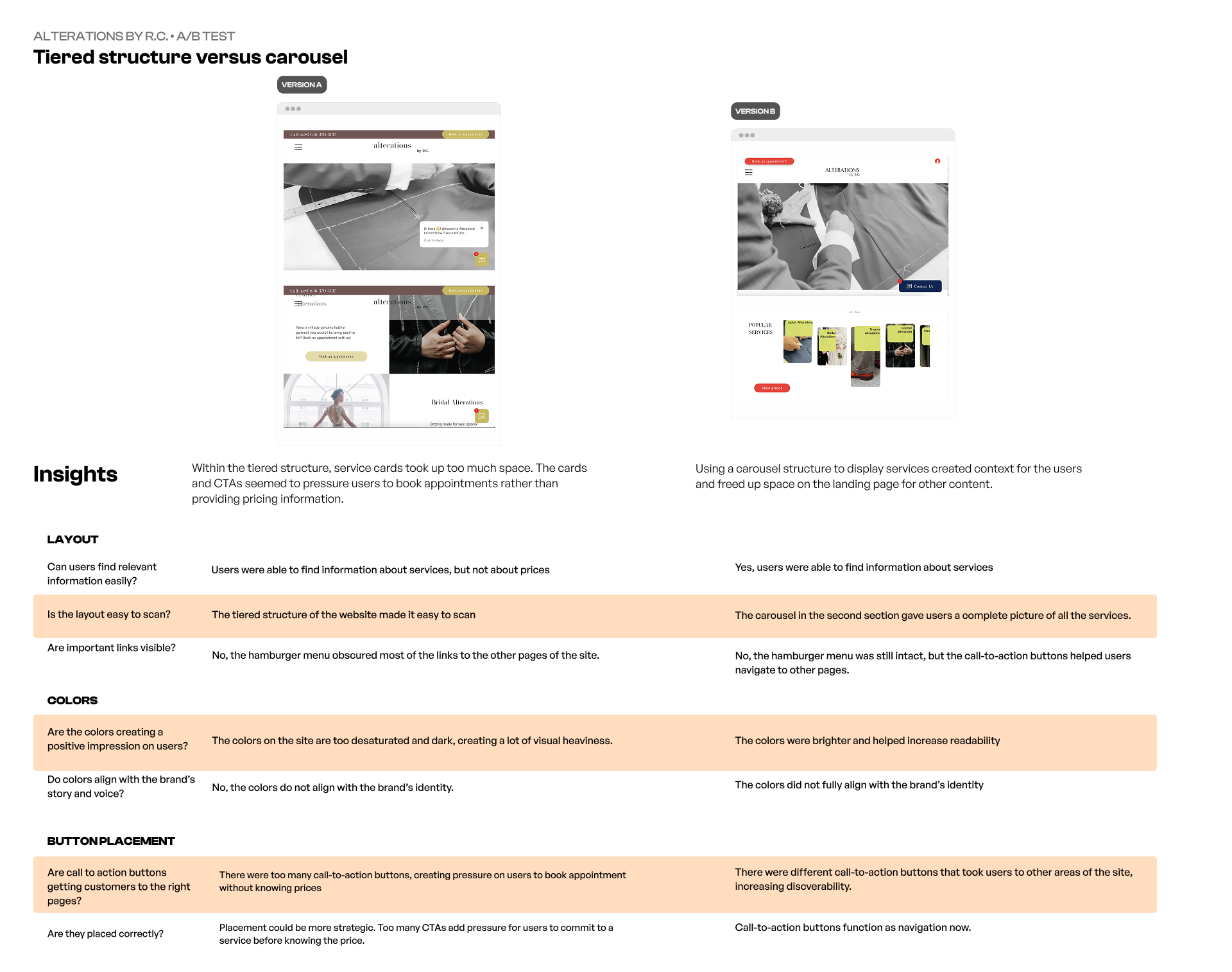
After running an A/B test for three weeks, more than 70% of site visitors moved past the homepage. Visibility for the booking flow increased in-store conversion by more than 30%.
Changing colors and tone helped create a warmer and more honest site that turned site visitors into customers.
An A/B test demonstrated two key changes: 1. changing the color palette and tone of voice created more booking appointments, and 2. moving popular services to the homepage instilled a sense of transparency towards the customers, which made them feel comfortable booking appointments.
Key Insight: Customers were moved by an honest and friendly tone.
A new brand identity that showcased the company's voice.
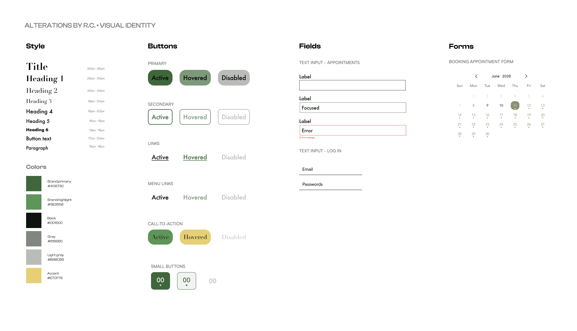
The final layout, colors, and microcopy worked together to create a visual identity that would later serve as the foundation for the business’s brand identity.
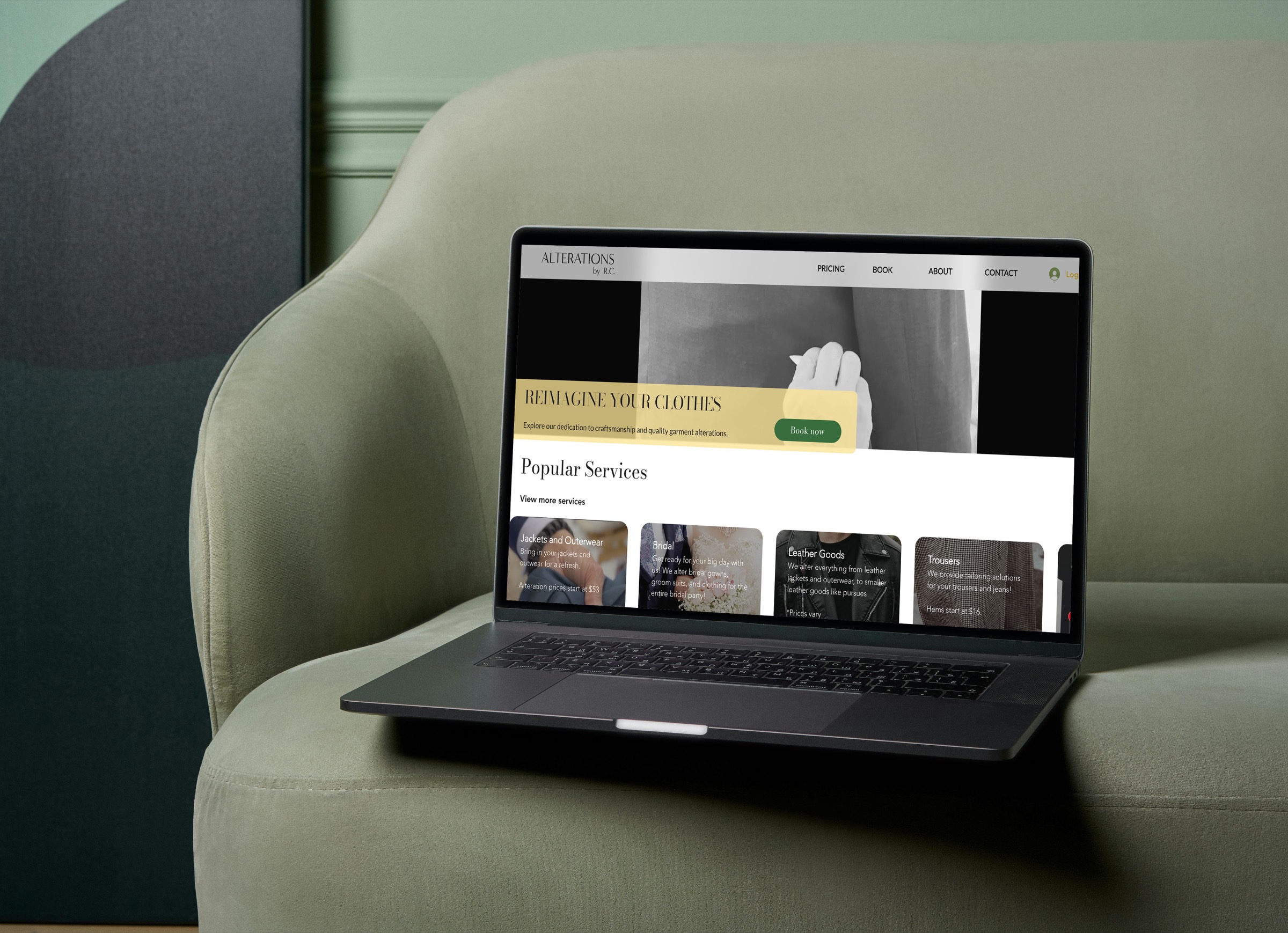
Final Design
To view the full site, click here
Reflection
Go with your instincts.
When I began the redesign for Alterations by R.C., I had many instinctual design choices that I often second-guessed but later on ended up choosing. This project taught me to trust my design instincts instead of doubting; it saves time and helps ship a finished product faster.